🎨 Top 10 Design Tips for Professional Booklet Printing
Designing a professional booklet is about more than colors and fonts — it’s about how every page communicates your brand’s story. A well-designed booklet captures attention, improves readability, and enhances your credibility. Whether you’re working with a custom booklet factory or designing in-house, these 10 practical tips will help you achieve stunning results that look polished and print perfectly.
🧩 1. Start with a Clear Purpose
Before diving into layout or visuals, decide what your booklet should achieve. Is it a product catalog, a training manual, or a brand brochure? The purpose will guide every design choice — from paper weight to tone of imagery — ensuring your booklet feels cohesive.
✏️ 2. Define a Consistent Layout Grid
A grid keeps your pages organized and consistent. It aligns text and images, improving visual flow. Use margins and columns wisely — generous white space makes content easier to read and gives your design a modern, professional feel.
🖋️ 3. Choose Readable Typography
Typography is one of the most powerful design tools. Select no more than two font families — one for headings and one for body text. Sans-serif fonts like Helvetica or Open Sans work well for modern styles, while serif fonts add elegance to corporate booklets.
🌈 4. Use Color with Intention
Color can influence emotions and brand perception. Keep your palette simple and aligned with your logo or visual identity. For booklet printing, use CMYK color mode to ensure accurate reproduction. Avoid overly bright colors that may shift during printing.
🖼️ 5. Invest in High-Resolution Images
Low-quality images can ruin even the best design. Always use 300 DPI or higher for print. A booklet manufacturer can check your files before production, but it’s best to prepare properly — sharp, vibrant images instantly elevate your project’s quality.
📏 6. Plan for Bleed and Safe Margins
When printing, every design needs extra space around the edges. Add at least 3mm of bleed to avoid unwanted white borders, and keep important text or logos within the safe area. These simple steps ensure a flawless final cut.
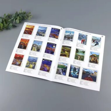
📚 7. Balance Text and Visuals
Avoid overwhelming readers with too much information. Alternate between text-heavy and image-heavy pages for a smoother rhythm. Visuals like charts, infographics, or icons can help explain complex ideas clearly and memorably.
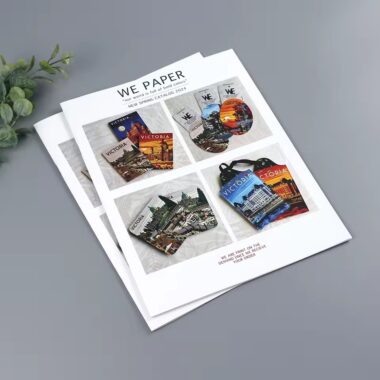
💡 8. Design a Strong Front and Back Cover
Your cover is the first impression. Use a powerful title, clear branding, and one striking image or color block. The back cover can feature contact details, QR codes, or a short brand statement — perfect for professional custom booklet printing presentations.
🪶 9. Consider Paper and Finish Early
Design isn’t only digital — paper texture and finish influence perception. Glossy paper enhances vivid colors; matte feels elegant; silk gives a balanced tone. Your chosen finish should complement your brand message and target audience.
🚀 10. Review, Print a Proof, and Test It
Before full production, always print a proof copy. Check color tones, margins, and readability under real lighting. Ask colleagues or clients for feedback. A booklet printing factory can adjust based on your proof to guarantee the best results.
🏁 Conclusion
A professionally designed booklet builds trust and leaves a lasting impression. Focus on clarity, consistency, and printing precision — the hallmarks of great design. When you combine thoughtful layout choices with the expertise of a reliable booklet manufacturer, every page reflects the quality and professionalism of your brand.
To explore binding and paper options, visit our Perfect Bound Booklet and Custom Booklet Printing pages for more inspiration.